Popup Handling in Selenium


There are different types of popup and alerts in Web application some are javascript popups and some are HTML for handling them in selenium WebDriver there are diff ways.

What is an Alert?

Alert is a small message box which displays the on-screen notification to give the user some kind of information or ask for permission to perform certain kind of operation. It may be also used for warning purpose.

Different types of Alerts

Simple Alert
Simple alerts just have an OK button on them. They are mainly used to display some information to the user. The first alert on our test page is a simple alert. The following code will read the text from the Alert and then accept the alert. An important point to note is that we can switch from the main window to an alert using the driver.SwitchTo().Alert().

Prompt Alerts
In prompt alerts, you get an option to add text to the alert box. This is specifically used when some input is required from the user. We will use the SendKeys() method to type something in the Prompt alert box.

Confirmation Alert
This alert comes with an option to accept or dismiss the alert. To accept the alert you can use IAlert.Accept() and to dismiss you can use the IAlert.Dismiss().

JavaScript Popup: – we can’t inspect javascript popup because it is not written in HTML also we can’t move javascript popups. In order to handle that popup, there is an interface called Alert.

In order to handle javascript popup first, we have to switch the driver control to the Javascript popup.For switch the Control we have to use driver.switchTo().alert() .
Methods present in Alert interface
accept();
dismiss();
sendkeys();
getText();


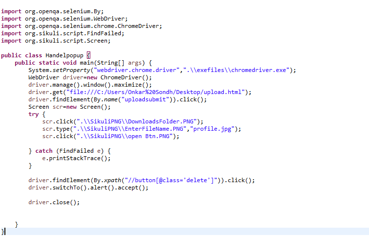
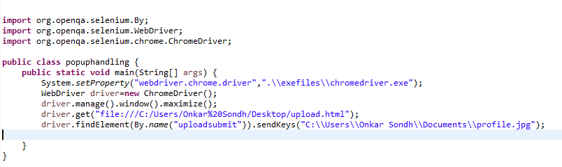
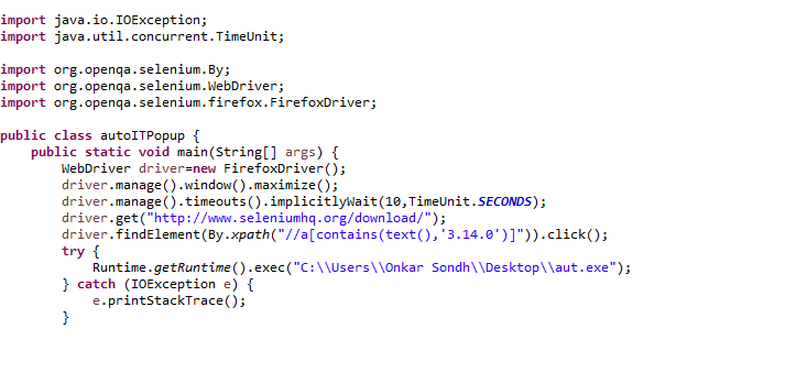
File Uploading Popup: – For uploading file uploading popup we can use sendKeys(); or we can use window automation tools like AutoIt and Sikuli. Also, we can’t inspect and move these popups.

Using the sendKeys Method


Using Sikuli with selenium:- sikuli is an open source image recognition automation tool which is used to automate the desktop applications, web applications, and gaming applications. To use sikuli with selenium copy sikulixapi.jar and in the libraries.


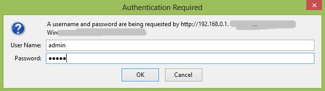
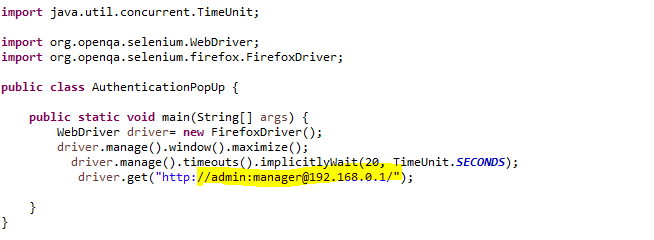
Authentication Popup:- The title of this popup page is authentication required and this popup also contains 2 fields Username and Password.


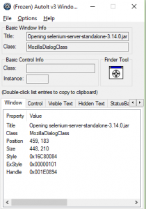
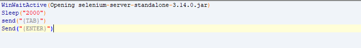
File Download Popup Handel using AutoIt:- AutoIt is an open source window automation tool which uses a basic scripting language for writing that script we use “AutoIt Script Editor” and for inspecting the popup we use “AutoIt window info tool”.
1. First, we have to inspect the popup using “Finder Tool”.

2. Open SciTE Script and AutoIt code and save that AutoIt code with the extension of “.au3” then right click on that file and compile Script which will generate a “.exe” file.


Conclusion
In this tutorial, we tried to make you acquainted with the WebDriver’s Alert class that is used to handle web-based pop-ups. We discussed the different types of popup and alerts in a Web application. Some are javascript popups and some are HTML for handling them in selenium WebDriver there are diff ways.

Difference Between iOS and Android Development

First of all, let us analyze the fundamental thoughts installed in the usefulness of iOS and Android by their makers. This will enable us to make sense of which standards and guideline a developer ought to depend on while making new applications for a picked platform. We would then be able to start understanding the contrast amongst Android and iOS development.

On the off chance that you are toward the start of your programming profession, you have presumably addressed yourself a few times concerning which improvement circle to choose – iOS or Android. This article analyzes the upsides of these stages from the developer’s perspective, and furthermore thinks about prospects for the development of a company’s software.

At the point when looked with choosing to pick between iOS versus Android application improvement, the decision might be to some degree paradigmatic. Makers of the two stages are ceaselessly in the advancement arrange as they work to enhance and actualize new highlights all the time. These two are continually contending as far as openness and curiosity of highlights, which considers both cell phones client and developer interests. Anyway, which alternative should a fledgling mobile application developer pick?

KEY DIFFERENCES

Coding- The fundamental language utilized in the development of Android applications is Java. Thusly, developers utilize Objective-C and Swift to make programming for iOS stages. Despite which dialect you pick, the immense web-network of developers is going be a verifiable preferred standpoint for you. Should you experience certain issues amid programming development, it is for all intents and purposes ensured that you will discover an answer on the web. What is vital to note, in any case, is that you should have a unique Apple gadget (e.g. Macbook) with a specific end goal to figure out how to program for iOS – a reality that confines the conceivable outcomes of many starting software engineers.

Design- iOS and Android both have numerous fundamental differences in design. Specifically, we can take note of that the general element of Apple’s pictograms, symbols and catches are their moderate, compact plan. Android website specialists are roused by a relatively indistinguishable Material Design thinking. In that way, the nonattendance of odd, huge symbols and lines is comparative for the two iOS and Android development. Moreover, the craving to apply a tactile board on cell phones (barring the need to utilize physical catches) can be obviously followed in the most recent renditions of Android OS. Let us additionally take note of the presence of multitasking boards on the two stages. iOS has isolate smaller than usual windows; Android has compatible tabs that fit crosswise over nearly the whole screen. The stages likewise have diverse styles of catches, with coasting catches that cast shade on Android gadgets, and the more complex basic and stylishly present-day plan of iOS. This administers likewise applies to symbols: iOS makers request the lines utilized in symbols to as thin as would be prudent (instead of Android).

IDE- iOS and Android use different apparatuses for mobile application development (IDE). Google, being the official proprietor of Android, presented the multifunctional and staggeringly open IDE Android Studio (changing from Eclipse ADT, which uses Java, C, and C++). This altogether streamlined the procedure of application advancement for the stage. Then again, Apple is unquestionably predictable as to this inquiry, with programming developers utilizing XCode for the past number of years. New forms are discharged every once in a while, the most recent of which bolster Swift (a standout amongst the most developed coding dialects for iOS).

Importance- Android creation has been driving deals available of savvy gadgets for as far back as eight years. On the off chance that we dissect propensities in deals, we can see that the fame of Android-based gadgets is developing yearly, despite the fact that the piece of the overall industry of iOS had diminished by 21% toward the finish of 2016. Such readings, in any case, can’t altogether influence the prominence of certain versatile applications, because of propelling cross-stage improvements.

MOBILE UX/UI DESIGNING IN 2018

2018 has been an eventful year for UX/UI designing in Mobile. With the incoming of Full-screen experiences with the launch of iPhone X and Oneplus 6. People are looking for a more personalized experience and as designers, we should provide them that.

Let’s take a look at all the trends that came in 2018 and are here to stay for a long time.


Simplify for the client

When we connect with apps or sites, we have a specific objective. What’s more, typically, the less we spend on accomplishing this objective, the better we understand.


Direct User Flow

A direct design encounter is UX with a particular start, center, and end that enables clients to finish one activity with each progression.  Linear user flow is useful for clients since it permits to gauge how much time it’s required to finish an errand.


Content-Centered Experience

All around curated and effortlessly available substance is the thing that makes a portable application speaking to its proposed clients.


Cleaning up

Deleting visual mess and enhancing perception is a well-known objective among numerous UX designers today. Designers remove commotion and organize important data by putting content first and explaining clear visual dialect.

Have a reasonable request with how UI components are introduced to make content perception less demanding. Solid visual signifiers, (for example, differentiating hues for the invitation to take action catches) are utilized to coordinate client on certain intuitive components or basic data.


Full-Screen Experiences

With the arrival of Samsung Galaxy S8 and iPhone X, frameless design turned into a pattern. More screens space accessible for clients and they hopes to have full-screen encounters.


HD Images and Videos

Not just the way that your application ought to give full-screen encounter is imperative. The nature of advantages will directly affect client assumptions regarding your application. Pictures ought not to show up pixelated on a versatile screen.


Passionate Experiences

In 2018 we’ll see more passionate knowledge incorporated into the portable experience. EI is not anymore about vivified impacts demonstrated when a client finishes particular activities. EI is an intense method to make the experience all the more captivating and great.


Better Way To Express Emotions

Communicating feelings is normal for individuals. Indeed, even in the time of summoning string interfaces, we utilized emojis to influence other individuals to comprehend what we feel.

In the time of cell phones, we have a chance to share a considerably more expansive ghost of feelings. Face acknowledgment will be utilized to give more applicable responses. One of such innovations is Animoji — animated emoticon which reacts to outward appearances by means of the iPhone X camera.


Give Content Based on User Location

Since cell phones are going with clients, the apps introduced on the gadgets can use area information to give content which will be significant to the client’s present area. This makes benefits more receptive to the conditions around them. Some apps like Starbucks have as of now use this property to give exceptional offers to clients. In 2018 we’ll see more apps utilize those abilities to improve understanding.


Custom fitted User Interface

Personalization in UI design isn’t just about substance. All clients are all different — some of us have poor visual perception, others may be partially blind. So for what reason ought to the apps have the same UI for everybody?

Personalization will be likewise about adjusting a format to a man. This can be accomplished by using data as of now given by the client and by utilizing gadget sensors (following how clients cooperate with the application and what issues they confront). In light of this data, apps can decide whether the greater text dimension is required, or it’s critical to make the sound louder when playing recordings.


Ways To Make Your Web Application More Accessible

Why should you care about accessibility?

Because…

Around 15% of the total populace lives with some type of disability, of whom 2– 4% encounter huge troubles in working. Everyone is now and again incidentally disabled — in a sense — whether you cut your finger or you attempt to peruse on your low complexity screen on a bright day.

By enhancing the openness of your website, you don’t just help individuals with the disability. You will basically make it more usable for everybody.


  1. Pick a  content management system that backs availability.

There are much content management systems accessible to enable you to fabricate your website. Basic cases incorporate Drupal and WordPress, yet there are numerous different alternatives accessible.

Once you’ve picked a  content management system that suits your requirements, make a point to pick a topic/layout that is open. Counsel the subject’s documentation for notes on openness and tips for making available substance and formats for that topic. Make certain to take after similar rules while choosing modules or gadgets.

For components like altering toolbars and video players, ensure that they bolster making the open substance. For instance, altering toolbars ought to incorporate choices for headings and open tables, and video players ought to incorporate shut inscribing. The content management system organization alternatives, (for example, making a blog entry or posting a remark) ought to be available too.


  1. Utilize headings accurately to sort out the structure of your substance.

Clients can utilize making a beeline to explore content. By utilizing headings (<h1>, <h2>, and so on.) accurately and deliberately, the substance of your website will be efficient and effortlessly translated by users.

Make sure to hold fast to the right request of headings, and separate introduction from the structure by utilizing CSS (Cascading Style Sheets). Try not to pick a header since it looks great outwardly (which can confound screen peruser clients); rather, make another CSS class to style your content.


  1. Incorporate appropriate alt text for pictures.

Alt content ought to be accommodated pictures, with the goal that clients can comprehend the message passed on by the utilization of pictures on the page. This is particularly critical for instructive pictures, (for example, infographics). While making the alt message, the content ought to contain the message you wish to pass on through that picture, and if the picture incorporates content, that content ought to likewise be incorporated into the alt.

The exemption to this lead is the point at which a picture is utilized only for design; for this situation, the alt content can be left vacant (connect is outside) with the goal that the screen peruser client isn’t occupied from the more vital substance on the page.

On the off chance that a picture is the main substance of a connection, the screen peruser will read the document name if alt content isn’t given. Continuously give alt content to pictures that are utilized as connections.


  1. Give your connections one of a kind and spellbinding names.

While incorporating links in your substance, utilize content that appropriately depicts where the connection will go. Utilizing “click here” isn’t viewed as elucidating, and is incapable for a user.  

Much the same as located clients check the page for connected content, outwardly hindered clients can utilize their screen per users to filter for joins. Subsequently, screen readers clients regularly don’t read the connection inside the setting of whatever remains of the page. Utilizing clear content appropriately clarifies the set of connections to the screen client.

The most one of a kind substance of the connection ought to be displayed first, as screen peruser clients will regularly explore the connections list via seeking through the principal letter.

For instance, in the event that you are guiding guests toward a page called “About Us”:

Do whatever it takes not to state: “Snap here to peruse about our organization.”

Rather, say: “To take in more about our organization, read About Us.”


  1. Utilize color with the mind.

The most widely recognized type of color black, red-green color inadequacy, influences around 8% of the populace. Utilizing ONLY colors, for example, these (particularly to demonstrate required fields in a shape) will keep these people from understanding your message.

Different gatherings of individuals with handicaps, especially clients with learning incapacities, advantage significantly from color when used to recognize and sort out your substance.

To fulfill the two gatherings, utilize color, yet in addition make certain to utilize other visual pointers, for example, a reference mark or question mark. Make sure to likewise recognize squares of substance from each other utilizing visual partition, (for example, whitespace or fringes).

There are a few instruments you can use to assess color differentiate, which will help you in making your page as outwardly usable as conceivable to people with low vision or fluctuating levels of color vision deficiency.


Ways by which you can make Content Writing a boon for UX

Two expressions of microcopy can twofold a site’s deals or lead transformation numbers. Content writing is something beyond verbs on catches. Microcopy merits a similar consideration that each other level of the UX gets.


Utilize different proofreaders

The content can’t bear the burden of grammatical errors when it is out for the world to see. It affects the authenticity of the site.

You would be stunned how frequently microcopy isn’t edited. Individuals will edit a whole site, however, overlook “the little stuff.”

Use the greatest number of editors and proofreaders as you can. This encourages you to maintain a strategic distance from normal mistakes like “Your going to sign in” or “You’re going to login” (login isn’t a verb).


Don’t make the client stressful

The content present on the website is to help the client have a clear idea what’s the actual deal is about. Confusing the user by using difficult words will beat the purpose of copy.

They may stress that joining takes too long. Essentially including “You’re 60 seconds from making your account” will wipe out this dread. Or then again including “You can change this whenever” to an email or username field will address their feelings of trepidation of being bolted into something.

Make the client crave all that they need is practically around the bend. Along these lines, consider changing the non-specific “Sign in” to something more dynamic.


Focus on the idea

Rather than simply “filling in the spaces” on catches and structures, consider the activities and results you’re searching for.

The client suffers when microcopy is hurried or not thoroughly considered.

Use content in such a way that it causes action. The result will be only produced when the user acts accordingly as the content suggests. Use less but strong words. The idea should be delivered.


Try not to request that it do excessively

Great copy can’t settle awful design. Also, microcopy can’t manage the client through a wonky UX.

On the off chance that you can’t clarify what a client needs to do in eight words or less, at that point reevaluate the design.


Get in your client’s head

You think you know individuals. So you picked the words that you figured individuals would react to. However, they’re not reacting. Presently what?

Ease of use testing gives you bits of knowledge into what parts of the copy are clear, and what befuddles the client. So ensure you screen how the clients respond to microcopy amid these tests and roll out the required improvements.


Return to it when things aren’t working

On the off chance that the site is failing to meet expectations, some basic copy changes can enable you to change over more leads ordeals.

Little changes can have an immense effect. So, examine the microcopy when things aren’t working.


Repeat the estimation of your offer

In case you’re giving something without end for nothing, yell it uproariously. Your microcopy should read, “Snap here to download our free___,” or “Round out this frame to begin your free preliminary.”

Remind them it’s free at each progression.  


Stay away from language

Try not to stress. Everybody does this.

Most web, deals, and microcopy is stifled with language. Basically, individuals need to sound shrewd. A great many people expect utilizing industry particular language makes them seem like an industry master.

In all actuality, having the capacity to pass on specialized data in straightforward terms passes on a far more noteworthy dominance of the theme.


Utilize particular and accommodating blunder messages

Continuously tell the client what’s wrong and how to settle it. Nothing disappoints me more than being informed that either my username or my secret word isn’t right. For what reason do I need to figure out which? You know which part I messed up. For what reason would you say you are keeping it a mystery?

Converse with your client like a man. Reveal to them the charge card number they entered is too short, rather than saying “Invalid information.”


Take the risk to include social evidence

There’s nothing amiss with reminding your clients or endorsers they are going to complete an extremely shrewd thing.

Not every person considers microcopy. Be that as it may, in case you’re one of only a handful couple of individuals who utilize it deliberately to fabricate or improve the general understanding, your clients and customers will love you.